
What are Hotspots?
Webpage hotspots are UI/UX elements that draw a user's attention to a designated point on the screen. The pattern can come in different forms, like a red spot or a pulsating light.
The beauty of hotspots is that they allow users to access onboarding information on-demand, allowing for cleaner, uncluttered interfaces.
Essentially, hotspots are about balance. You need to use the visual space without overloading it with text. However, you’ll also want to be able to expand the content when needed. Hotspot beacons are a great choice because you can put lots of information behind each spot without making your presentation feel overwhelming.
Hotspots can be thought of as a midpoint between tooltips and notification badges.
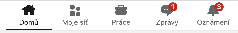
In our example from LinkedIn below, notification badges offer a static red reminder that two notifications are waiting to be clicked.
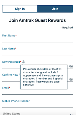
In the example from Amtrak below, when a user interacts with the ⓘ, they receive information about the parameters of a suitable password.
As mentioned above, hotspots are something in between these two examples. You can use a hotspot beacon to direct user attention to particular places or features within your product.
You can choose to accompany a hotspot beacon with a tooltip that displays when the user interacts. Alternatively, a tooltip can be left to stand alone to prompt your user to click and explore a particular element.
Hotspots are an excellent way to show users what they need to do or where they need to go when using an app or product. When employed thoughtfully, you can create semi-guided user onboarding experiences that allow your users to navigate products.
Below we’ll show how various SaaS products use hotspots to facilitate a self-serve approach to onboarding.
But first, let’s explore the benefits of hotspots.
Benefits of Using Hotspots
There are a lot of onboarding ux patterns available. Each of them has its strengths and weaknesses, depending on the context.
Hotspots are an excellent tool for most products or services. While developers have been using them more frequently lately, they are underutilized for the most part. But if you want to avoid a cluttered interface or overloading your users with information, a hotspot beacon could be a perfect choice.
So, let’s look at the benefits of hotspots.
#1. Simplicity
Everyone knows that the key to user onboarding best practices is to eliminate friction. The cleaner, clearer, and uncluttered your interface are, the easier it is to guide your user towards realizing the value of your products.
Sometimes, you need to deliver crucial information to get users on their way. For example, you might use a tooltip to display a bite-sized chunk of essential text. Or employ a user onboarding checklist to ensure that users are engaging with the product in a defined, structured way. Additionally, you might choose a product tour in the form of a collection of tooltips.
All of these options are good because they streamline the process of getting your users up to speed with the product.
However, hotspots offer an even simpler alternative. Graphical elements don’t get any more straightforward than hotspot beacons. It is, after all, just a flashing or pulsing light.
When used in conjunction with other UX patterns, hotspots can provide an effortless way to guide users around the screen.
#2. They’re Visual
Users process visuals far quicker than text. Writing has been around for about 5000 or more years, while the eye is more than 500 million years old. Our brains are hardwired to digest and process visual information at about 60,000 times the speed of text. All that is to say that using visual information creates a far more instinctive and intuitive feeling for the user.
In fact, it’s often only when you step back and think about it that you realize you’ve used a hotspot. That’s the gold standard of semi-guided user onboarding: a fluid, almost subconscious, self-serve interaction with your product or service.
#3. Interactivity
Another great benefit of hotspots is that they encourage users to interact with the product. Typically, developers choose to link these patterns to a task, area, or feature of their app or service. Getting users engaged with a product is the first step to demonstrating value.
#4. Reduce Customer Support
Self-service products are about far more than reducing customer support overheads. Users prefer to engage in learning and problem-solving at their own pace, at a time that suits them. Along with other judicially placed elements, you can use a hotspot to showcase your product or service easily.
#5. Good Visual Fit with Your Color Scheme
Another plus point of hotspots is that they can easily match your apps or service’s color scheme. If you’ve established an aesthetic for your product, you will need to strike a balance between directing the user’s attention while not ruining your interface.
Hotspots are most frequently red, but you can choose whichever color you like so that it fits into its surroundings. Transparent red works very well over most applications; however, you can do what works best as long as it stands out just enough.
#6. Drive Conversions
Hotspots are also an excellent pattern when you want to drive conversions. You can use them to call attention to a call-to-action (CTA) or other preferred behavior. Because the user clicks on the beacon, you can add some microcopy to trigger when they engage.
Additionally, some websites use them to highlight products or links that they would like a user to select.
Where to Use Hotspot Beacons
You can use hotspots to achieve lots of user onboarding goals. Here are just a few of the user onboarding examples where you can use this feature.
New Features
If your app or service has a new feature, hotspots are a great way to:
A) Inform your users about the new features
B) Show them where they can access the new feature.
Additionally, when used with tooltips or other patterns, they can set users down the path of learning to use a new feature.
Contextual Help
Hotspots are an excellent way to offer help in the context of what the user is trying to achieve. For example, if the user takes a particular action, you can use a beacon to guide them to the elements or features they need to select to achieve this goal.
In this way, they can work as semi-guided tours for specific goals.
Guide User Behavior
Users have a goal that they want to achieve through your product. Depending on the complexity of that goal, you may need to set out a clear path or set of instructions that guide them towards getting value from the app.
Similarly, you may want to encourage your users to explore your products, learn how to get value from your product, or nudge them towards specific actions.
Tooltips are a fantastic way to guide your users around a product so that they can understand its capabilities and value.
Helps Migrate Users to New Interfaces
Hotspots are an excellent choice if you have a product with a new interface. You can take advantage of the fact that your existing users are familiar with how the product works and use beacons to highlight the areas or features that have changed without overloading the screen.
Hotspot Examples
#1. Ghost

Ghost is an open-source blogging platform. It aims to make online publishing simple for individuals and online publications.
Because the platform has several key features, they use hotspots to guide the user around the interface. The blue pulsating dots chime well with the overall design. As seen above, clicking on each hotspot triggers a tooltip that briefly explains a feature and also contains a link to further reading on the subject.
Ghost is an excellent example of using hotspots to onboard users to more complex products. Developers can hide longer and more complex Information behind hotspots and tooltips. As such, more experienced users can easily navigate the interface while information is still available for users who require more information.
#2. Krispy Kreme
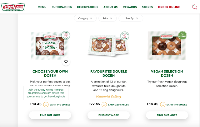
Krispy Kreme makes delicious donuts. They also have a beautifully designed website. They introduced a rewards program that allows consumers to collect “Smiles” for each purchase.
As you can see in the example above, each smile icon is used to trigger some text clearly explaining what Smiles are and how you can use them.
Building the hotspot into your existing interface is a creative way to share information.
#3. Typeform

Typeform is a SaaS company that specializes in online surveys and form building. Their user onboarding features six different hotspots. While that might seem like a lot, it gives the user a semi-guided user onboarding experience because they can choose which features to explore.
Clicking on each hotspot triggers a tooltip that explains the function of icons.

Overall, the design of the hotspots is excellent. The pulsating blue grabs the user’s attention without taking away from the overall design or cluttering the interface.
This approach is good if you have an interface with several features that you need to highlight equally.
#4. VPN
#5. Pinterest
It’s straightforward and gets at the heart of why users find value in Pinterest.
#6. DressIT
These hotspots are an excellent example of a discreet design that is transparent enough not to affect the visual appeal of the clothes but still offers users a quick and easy way to access more information if required.
#7. Heap
Heap is an analytics platform for products. Because each product is different, users need to configure Heap to work for each product.
This scenario presents a common problem: how to educate users to get value for the product without overwhelming them with information.
Heap solves this issue by using an onboarding checklist. Additionally, each item on the list corresponds to a graphical element or text highlighted by a hotspot beacon.
This solution is an excellent example of how you can use hotspots with other onboarding patterns to guide users.
#8. Dropbox Paper
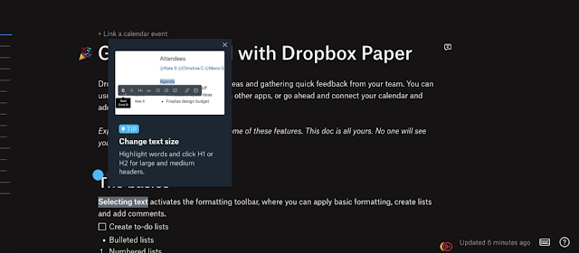
Paper is Dropbox’s document collaboration tool. It’s packed with several great features, and explaining them all presents a user onboarding issue. Dropbox’s solution is to include an example document. This example document is a great idea because it demonstrates the product while also educating the user.
As you see in the example above, when the user selects “The basics,” they are treated to a tooltip explaining basic features and playing a small video. There are several more examples of this tactic throughout the document. It’s fun, interactive, and informative all at once.
#9. Quartzy

However, they also use hotspots in their semi-guided user onboarding tour. In the example above, Quartzy uses a pulsating beacon to help users get oriented with the header bar. It flashes for each section, and when selected, it brings up a tooltip that describes the function of each heading. It’s clean and discreet.
#10. Evernote
Note-taking app Evernote puts a lot of thought into their onboarding. Customization, product tours, and checklists are just some of the tools they employ to guide their users.
In this example, Evernote uses a hotspot within its checklist. This pattern works because it makes the checklists seem less static. Additionally, it prompts the user to continue on their onboarding journey.
Hotspot Tips
Hotspots are a powerful user onboarding tool when used correctly. Follow our tips to ensure you get the most out of these UX patterns.
#1. Don’t Add Too Many
Some products have a lot of features and options that they would like to highlight. But adding too many hotspots on one page can confuse your users. That said, having a good number can help your users understand that there is a lot to explore in your product.
So, find the right balance between the two. A lot of this will be contextual.
#2. Keep Them Discreet
Just because a hotspot beacon is flashing doesn’t mean it should negatively affect the look and feel of your app. Semi-transparent designs with colors that compliment your product are enough to get the user’s attention without hurting your interface’s visual appeal and clarity.
#3. Use Hotspots to Hide Information
Good design doesn’t cognitively overload the user. If you have a product that needs to communicate a lot of information, you can hide it behind hotspots that trigger tooltips or links to other areas. This process helps the design feel uncluttered and provides a clear path for users to navigate the product.
Summary
Hotspots are an underutilized UX pattern that is excellent for user onboarding. While products should be designed to be as intuitive and straightforward as possible, most users will benefit from a bit of guidance.
You can use hotspot beacons for various user onboarding purposes, such as semi-guided tours. Additionally, you can overlay them across images and interfaces to prompt users to select desirable actions or offer them a path to access additional information or links.
One of the best aspects of hotspots is their subtlety. While they do grab the user’s attention, they don’t clutter up the screen or detract from the overall product design.
At their best, hotspots are something that helps guide users without them explicitly noticing. So, when you want to help your users get to grips with your product, consider using these effective UX patterns for semi-guided tours that will help them realize the value of your product.