
When a user sits down with a new software product, the ideal scenario is that it's easy to use. To drive user adoption, the interface needs to feel fluid and intuitive.
While this is the ultimate aim of an excellent user interface (UI), first-time users still need a helping hand in many cases. But a constant requirement to refer to walkthrough guides or tutorials breaks the user-software relationship.
Offering help in a seamless way is a subtle, elegant art.
To keep users engaged and to drive adoption, tooltips are an incredible resource. However, the software development industry has an awkward relationship with this solution; but, for the most part, this is due to poor application or design of tooltips.
While tooltips can potentially harm user experience (UX), they are barely noticeable and beneficial when done correctly.
What is a Tooltip?
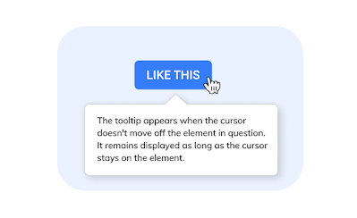
Tooltips are minor UI elements that prompt users to take specific actions.For example, when a user's mouse hovers over or clicks a specific spot on the UI, a tooltip is triggered. Designers can use this to provide users with many different types of help. Keyboard shortcuts, sharing the function of particular icons, or ways to use a product, and so on.

Benefits of Using Tooltips
There's no limit to what type of information can be used; however, there are nudges that prove particularly helpful for user adoption.User Onboarding
User Onboarding is the first impression of your product or new feature. Too much friction at this stage leads to quick or permanent abandonment.
Some products are vastly complex or novel. In these scenarios, a thorough product walkthrough or tutorial might be necessary. Additionally, many companies choose to send periodic emails or even offer user training.
However, in situations where the software is more simplistic, tooltips can work well. Clean, simple interfaces will prove intuitive to most users. But to ensure there is no confusion, a tooltip can be used to demonstrate the core functionalities.
Good onboarding explicitly demonstrates the value of your product quickly. When you have a user's attention, you need to keep it. Well-placed tooltips keep users in the zone while subtly selling them on the features of your product.
Lesser-Used Functions
Many products have a UVP that initially attracts users. However, other secondary features that add depth or greater functionality sometimes go unnoticed.
Additionally, when users rarely interact with a function, they are prone to forget how to use it the next time.
Developers can use tooltips to remind users how these lesser-used yet valuable features work. Again, these features should be there because they provide value. Making sure your user understands this is critical for adoption.
Updates and Reminders
Two great uses of tooltips can be employed to provide users with:
- Alerts about new software updates or functions
- To remind them about helpful features they are not taking advantage of
Contextual Tooltips
While tutorials are best for more complex tips, developers can provide contextual tooltips as the user navigates specific areas of the product. As users get to grips with the functionality, well-timed tooltips can gradually reveal more and more functions that will keep them around without overwhelming them during the onboarding stage.
Provide the Aha Moment
User adoption requires the users of your product to have an "Aha" moment. It's the point where they realize the value of your product and move from merely evaluating it to becoming an active user.
Tooltips are a great way to usher users to this stage by demonstrating how this problem addresses their pain points. Relying on users to just discover or stumble upon functions isn't a plan.

JavaScript, CSS, HTML, and more are obvious choices to code straight into the product. However, if user adoption is the main aim, specific tools, Digital Adoption Platforms (DAPs), are designed for the job.
DAPs are a software layer that sits on top of an app or website to help users learn how to use the platform. Of course, these solutions aren't limited to just tooltips; you can use them to drive adoption by sharing a range of education information, tours, or overlaid instructions.
However, DAPs excel at creating the type of simple, clean tooltips that developers should be striving for. With the ability to capture and analyze user behavior, they can identify and hurdles in user adoption; and then be used to remedy them with instructions or tips.
Try Usetiful, to make tooltips without coding. It’s simple and free.
Tooltips are intended to provide user assistance. They aren't meant to aggravate users by getting in the way of their experience.
So use them sparingly, in the places where they’re needed. When the UI is mainly visual and clear, constant tooltips over icons whose function is obvious will spoil experience and harm adoption.
Provide the Aha Moment
User adoption requires the users of your product to have an "Aha" moment. It's the point where they realize the value of your product and move from merely evaluating it to becoming an active user.
Tooltips are a great way to usher users to this stage by demonstrating how this problem addresses their pain points. Relying on users to just discover or stumble upon functions isn't a plan.
How To Make a Tooltip
There are a few different ways that developers can implement tooltips into their software.JavaScript, CSS, HTML, and more are obvious choices to code straight into the product. However, if user adoption is the main aim, specific tools, Digital Adoption Platforms (DAPs), are designed for the job.
DAPs are a software layer that sits on top of an app or website to help users learn how to use the platform. Of course, these solutions aren't limited to just tooltips; you can use them to drive adoption by sharing a range of education information, tours, or overlaid instructions.
However, DAPs excel at creating the type of simple, clean tooltips that developers should be striving for. With the ability to capture and analyze user behavior, they can identify and hurdles in user adoption; and then be used to remedy them with instructions or tips.
Try Usetiful, to make tooltips without coding. It’s simple and free.
How to Make Great Tooltips
Utilize Them SparinglyTooltips are intended to provide user assistance. They aren't meant to aggravate users by getting in the way of their experience.
So use them sparingly, in the places where they’re needed. When the UI is mainly visual and clear, constant tooltips over icons whose function is obvious will spoil experience and harm adoption.
Make them dynamic and Not Triggered by Frequently Used Tools
Tooltips are a great way to help orient users to functions that they will frequently use.
Tooltips should be dynamic and not be used to inform users of a product function repeatedly. While a user familiarizes themselves with a new product, tooltips are appropriate. If they keep popping up, users will become irritated.
Good Tooltips are Lean, Clean, and Helpful
Tooltips aren't a replacement for a tutorial. They are made to quickly and plainly inform users of specific functions.
Tooltips call for brief, explicit texts that demonstrate clear action for users. If you feel like you need something more extensive, it's best to save it for a video tutorial or knowledge base.
Keep it brief. Explain how and why to use the tool in the most efficient way possible. Two lines of text and 150 characters or less is good.
Tooltips Should Offer a Clear Exit Route
Each product has users of varying degrees of experience and familiarity. And a diversity of users means a variety of approaches to learning. Some people like to read every tooltip. Others just want to be able to explore. Therefore, tooltips need to be dismissed easily.
In the case of onboarding, an "X," a "Dismiss," or "Got It" option helps users clear the deck and immerse themselves. Additionally, many tooltips can be closed by clicking elsewhere on the screen.
Tooltips Should Parcel Out Information
While the temptation to show off the bells and whistles of your product is strong, developers need to consider their approach carefully.
Too many tooltips mean too much information. That can overload and confuse users, hurting adoption.
So, parcel out the information one at a time. Each tooltip should come up individually so that the user is sure which icon refers to which tip. When tools require complex relationships and combinations, a video tutorial or walkthrough is appropriate.
Placement is Key
There is a delicate balance between setting a tooltip in a place that will assist a user and putting it in an area that will harm interaction.
Thinking about where the user's eyes will be at the time of the trigger is crucial. If a user's mouse is hovering over an icon, the tooltip is best placed there. The temptation to reduce clutter by placing it near the bottom of the screen means they may not notice it.
Additionally, some tooltips for onboarding blur the background, drawing attention to the point of focus. Others use contrasting colors to highlight the tooltip.
Think carefully about where to place tooltips. A lack of consideration can mean that vital functions are obscured by the tooltip, confusing the user.
Tooltips Need To Be Part of a Holistic Approach to Consumer Education
When trying to drive user adoption, customer education needs its own strategy. Tooltips shouldn't be an afterthought; they should be considered during the UI design stage. This includes plans to design an interface so intuitive that tooltips are barely necessary.
The overall strategy applied to provide users with information about utilizing your product needs to take in all aspects of the customer journey, from marketing and awareness to onboarding and customer retention.
Tooltips should match the tone and information of any video tutorials or walkthroughs designed to help familiarize users with your product.
The copy should be brief and on-brand, and developers should carefully consider the placement.
Additionally, keeping tooltips for the most crucial nudges is essential. Overwhelming users with too much information is counterproductive. However, critical information needed to operate the product should always be displayed on the screen.
Tooltips should be dynamic enough to consider UX. Frequently used and therefore already understood tools don't need repeated tooltips. However, more rarely used functions can benefit from the odd gentle reminder.
Tooltips require judicial and subtle use. The aim should be to strive towards users only noticing them if they are not there. Seamless, discrete, and helpful, but not intrusive.
Tooltips can be built in-house with HTML, CSS, and Javascript. However, it is recommended to implemented them using a Digital Adoption Platform. Try Usetiful for the job - it's simple to start and completely free.
When trying to drive user adoption, customer education needs its own strategy. Tooltips shouldn't be an afterthought; they should be considered during the UI design stage. This includes plans to design an interface so intuitive that tooltips are barely necessary.
The overall strategy applied to provide users with information about utilizing your product needs to take in all aspects of the customer journey, from marketing and awareness to onboarding and customer retention.
Tooltips should match the tone and information of any video tutorials or walkthroughs designed to help familiarize users with your product.
Conclusion
While tooltips have a mixed reputation in the design community, they can be a valuable and powerful way to assist with user adoption.The copy should be brief and on-brand, and developers should carefully consider the placement.
Additionally, keeping tooltips for the most crucial nudges is essential. Overwhelming users with too much information is counterproductive. However, critical information needed to operate the product should always be displayed on the screen.
Tooltips should be dynamic enough to consider UX. Frequently used and therefore already understood tools don't need repeated tooltips. However, more rarely used functions can benefit from the odd gentle reminder.
Tooltips require judicial and subtle use. The aim should be to strive towards users only noticing them if they are not there. Seamless, discrete, and helpful, but not intrusive.
Tooltips can be built in-house with HTML, CSS, and Javascript. However, it is recommended to implemented them using a Digital Adoption Platform. Try Usetiful for the job - it's simple to start and completely free.