A great user onboarding experience is vital for user activation and retention. Getting it right will drive revenue and growth. But getting it wrong can lead to:
customer churn
wasted customer acquisition costs
loss of revenue
poor growth
Customer acquisition cost (CAC) is rising. This situation has underlined the importance of retaining customers. Great user onboarding allows your business to
keep customers
increasing customer lifetime value (CLV)
increase customer satisfaction
boost customer experience
drive revenues
We all need help from time to time. Customers are no different. To get the most from a product, they need a little guidance.
Good onboarding requires a lot of different things. But mostly, it's about showing users how to get the most from your product.
Let's look at the best ways you can help users unlock the power of your product or service.
#1. Know your users
Many products appeal to a wide variety of users. You should know who will use your product by the early development stages. It's an essential part of design and marketing that involves lots of research and the building of user personas.
Some of the benefits of understanding user personas is knowing:
what type of onboarding they'll respond to
what level of assistance they'll need
which features will be most important to them
what they'll use the product for
Of course, you should still leave room for flexibility, even with well-defined personas. Sometimes the kind of users — and uses of your product — will surprise you.
#2. Use a product tour
A product tour is a great way to show your users:
how your product works
how to use your product
and how to get value from your product
Users don't want to read manuals. They much prefer a learn-by-doing approach. Contextual on-screen guidance is an excellent way to show the benefits of your product while users explore it for the first time.
We helped the healthcare startup roHealth improve its onboarding completion rate by 47%. They took advantage of Usetiful's no-code onboarding tools to build product tours that showed their users how they could unlock the value of their product. This process led to a massive boost in customer retention.
You can read more about how they achieved their goals here.
#3. Award aha moments
An "aha moment" is when a customer understands your product's value. It can consist of a sequence of actions they need to take to realize how your product can help them achieve a goal or solve a problem. Once users understand why a product is valuable, they are far likelier to keep using it.
Making your aha moment part of your user onboarding process is essential. Firstly, it's part of a learn-by-doing approach. Secondly, it's a big part of reducing churn.
The marketing automation software Wishpond manages this by awarding users as they reach different milestones on their onboarding checklists. These rewards lead up to their aha moment, which happens when their users hit "Publish" on their first marketing campaign.
#4. Personalize onboarding
In step 1, we mentioned that each product has different user types. That can mean that your customers use your product in different ways. It can also speak to their relative degree of tech-savviness.
Considering this, your onboarding experience should be dynamic. One way to achieve this is through personalization.
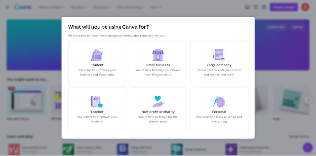
The graphic design tool Canva manages this situation well. At the top of their onboarding process, they ask users what they will use Canva to achieve and if they're a student, personal user, teacher, small or large business, etc.
Then they play a small tutorial video that reflects the user's occupation or preferences. This process is a great way to personalize onboarding by making it relevant to the user.
#5. Adopt a learn-by-doing approach
A learn-by-doing approach is considered one of the most effective ways to master anything. By engaging with something, we get instant feedback. This process allows us to reflect on what we are doing and adjust our approach while we work. Additionally, it helps information stick much better.
The writing assistant tool Grammarly has an excellent learn-by-doing approach. When users first open the app, they are presented with a document that is similar to the type they will hopefully write. In the document, Grammarly uses tooltips to show the users how to fix spellings, grammar, and use their other functions. Once they've worked on the example document, users are ready to edit their own work. It's brilliant and effective.
#6. Use tooltips
Tooltips are a fantastic way to make information accessible without clogging up the screen. The last thing you want to do is make your onboarding process overly complex. Information overload turns users off.
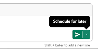
There are many great examples of using tooltips to highlight option features and functions. One of the most elegant is Slack's "schedule for later" feature.
Essentially, this feature allows users to time when they send a message. For example, if you're working late but want your colleagues to receive your message first thing in the morning.
Slack positions this tooltip right by the send message button. It is simple, helpful, and easy to understand. It's a superb example of a useful yet inobtrusive tooltip.
#7. Help the user feel in control
A considerable part of modern UX design is ensuring that users feel in control. Remember, they download a program because they have a problem they want to solve. They don’t want to feel lost or that they aren't in charge of the software.
One excellent example of making users feel in control is using a checklist. A good checklist details all the things a user needs to reach their aha moment within your product. However, they are free to complete each task at their own pace.
The HR management platform Grove HR uses checklists to break down a detail-heavy setup process into manageable chunks. Users can tick off each item easily. Additionally, each option contains videos, walkthroughs, and other information so users can get to know the product as they complete their onboarding.
Image 3: Grove HR uses a checklist for employee onboarding.
Conclusion
Getting users to download your product is hard enough these days. No one can afford to lose prospective users because they don’t know how to get value from your application. Using our best user onboarding practices, you can boost retention and unlock growth and revenues.
If you’re unsure where to start, have a look at Usetiful to see how we can help.


